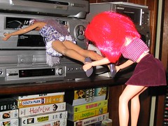
Watched a bit from the out of print Jem and the Holograms Seasons 1 & 2 last night. A few thoughts came to mind.
The design is ugly. No, really. The look of the show is God awful. And the color scheme is just plain bad. Bad, not just ugly but bad.
The music is an enigma. But then that could be said about the characters that inhabit the show...
skip to main |
skip to sidebar

a word in edgewise
"where the line is drawn"
Pages
About Me
links
- tohoscope at pixiv
- tohoscope at tinypic
- tohoscope at dreamwidth
- tohoscope at posterous
- tohoscope at newgrounds
- tohoscope at blip.tv
- tohoscope at vimeo
- tohoscope at deviant art
- tohoscope at drunk duck
- tohoscope at webcomics nation
- tohoscope at last.fm
- tohoscope at wordpress
- tohoscope at soup
- tohoscope at tumblr
- tohoscope at livejournal
- OtakuHELL Project
- HELL Project
- Garbageman
- moving sketch
Search This Blog
Trailers From Hell
Blog Archive
-
▼
2006
(300)
-
▼
January
(28)
- Maybe Sunday?
- VHS and a DVD
- blenderboys
- Jem In A Jam
- Befitting Ms. Fitz
- Ms Fitz
- asg to x3d converter
- Night of the Return of the Dancing HEINOS!
- Return of the Dancing HEINOS
- An open letter from the EFF
- A long soaking rain
- Heino Die Show
- Whatever it is
- Video funhouse
- Lack of technical experiance
- Mahjong Kung Fu
- Forum Phun
- A season in HELL
- Promos
- Current Studio // VC2 Survival Guide
- Waiting for the bill
- Shocker!
- Birdy & Bunny
- Waiting for the Mazda 3
- Music from a lost moment
- Pixie la Dixie
- In the wash
- Washed up
-
▼
January
(28)
Copyright © 2009 www.dantearaujo.net. Designed by Dante Araujo.

1 comments:
I prefer BARBIE AND THE ROCKERS. At least I think I do.
Post a Comment