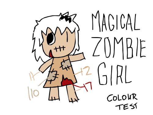
I was trying to get more of a grey pallor to Zombie Girl's flesh, but it still looks to fleshy to me. Maybe I need to try a green or a blue hue for her skin? More colour testing tonight. And I think I need to show Zombie Girl next to Hell Nurse Katie to compare the colours. It's always hard to figure this stuff out. I tend to think in shapes and lines and construction and not so much on colour design. I want to keep it simple and readable.
0 comments:
Post a Comment